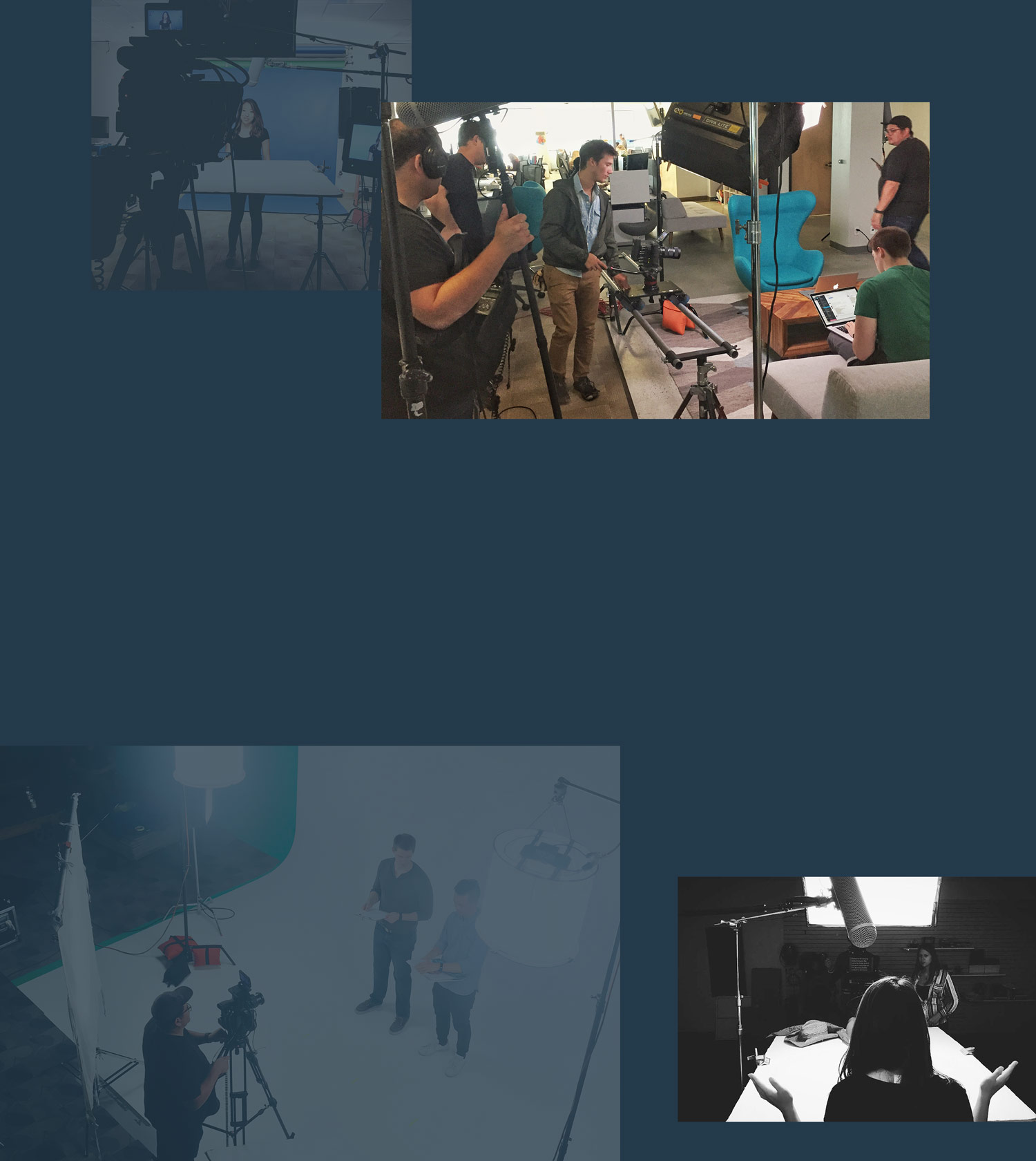
Creative Direction
Video Production
Strategy
6 months
All the motion graphics being used in Udacity’s classes were individually created by a rotating team of animators who were advised by a dozen different video producers. It’s a time-consuming process that results in a muddled, inconsistent visuals. Fonts, sizing, colors, positioning, backgrounds were different across all of Udacity’s classes.
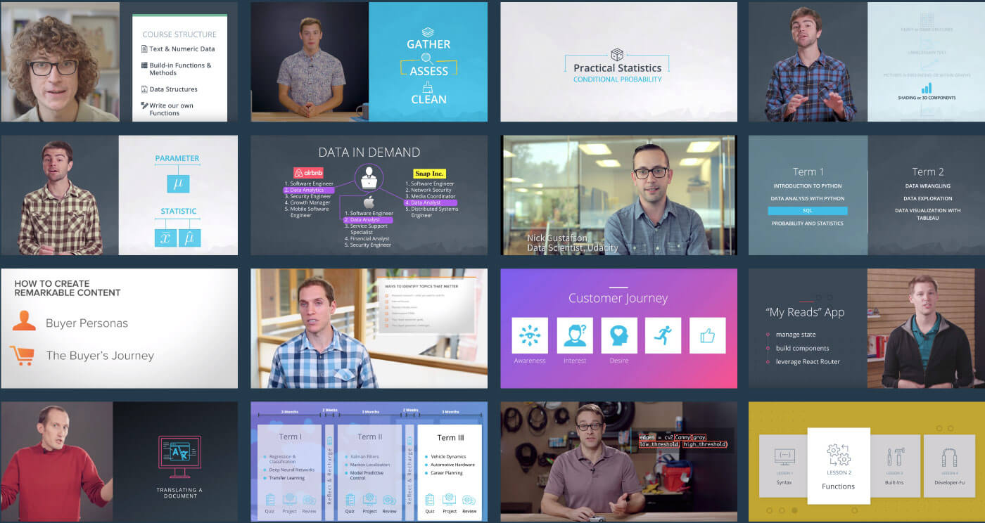
After a lengthy sourcing process, I hired design and animation duo, Daniel Luna and Yaniv Fridman. We worked on defining a new look for Udacity’s videos that were aligned with the rest of Udacity’s brand while also remaining flexible enough that each school and class would be slightly different from one another. Consistent yet individual? It’s a challenging problem to solve.
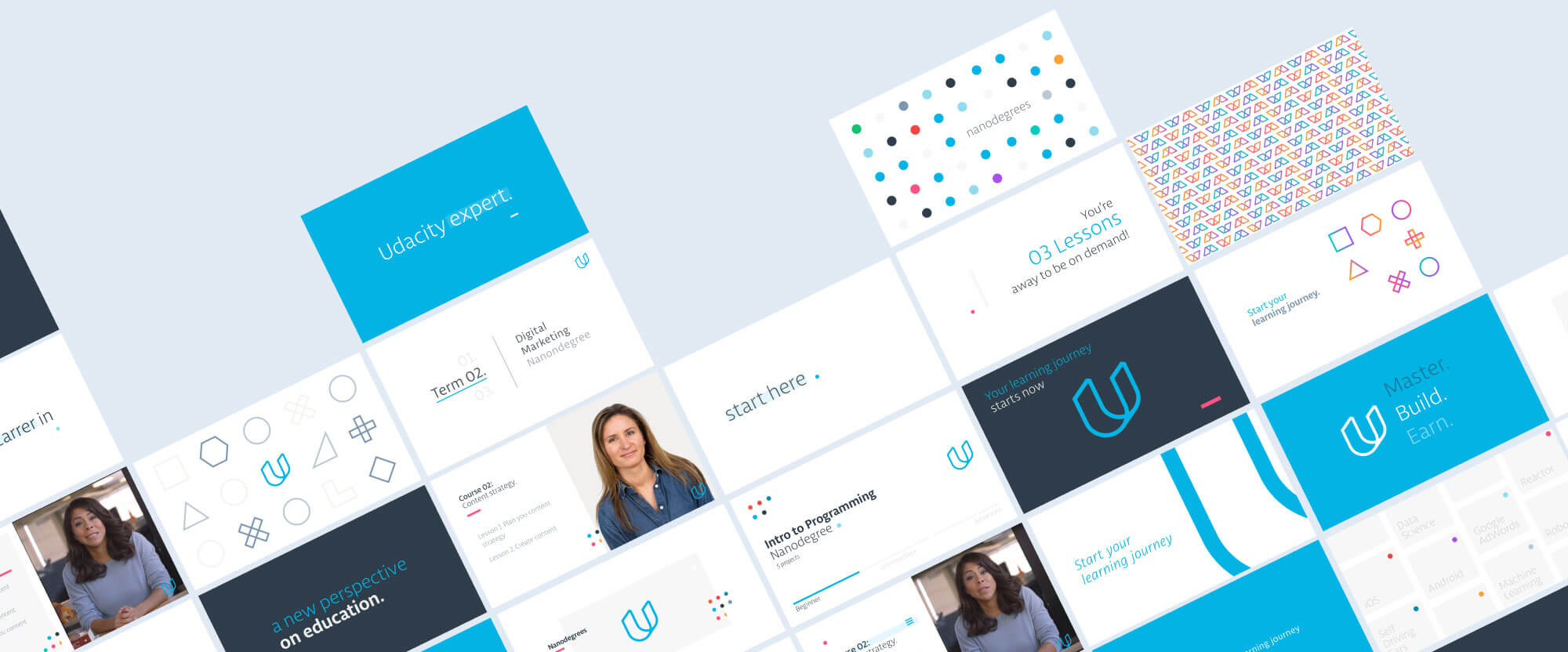
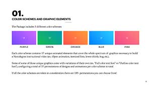
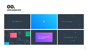
We settled on a brand system that gave each school a unique animated background inspired by the subject being taught. Then each curriculum within that school would be given its own individual color. It was defined and still infinitely expandable.
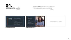
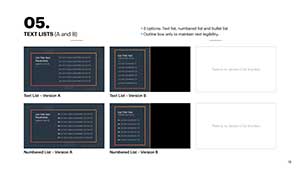
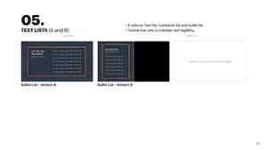
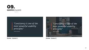
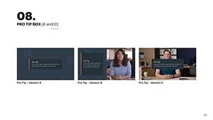
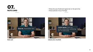
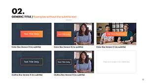
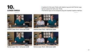
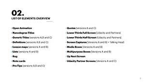
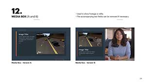
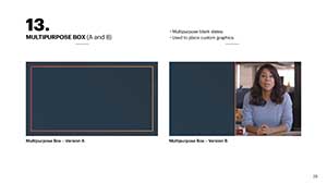
Over two dozen elements were then animated by Yaniv and Daniel. Almost every element a producer could need was included. These new animations were more visually complex and engaging without being distracting.
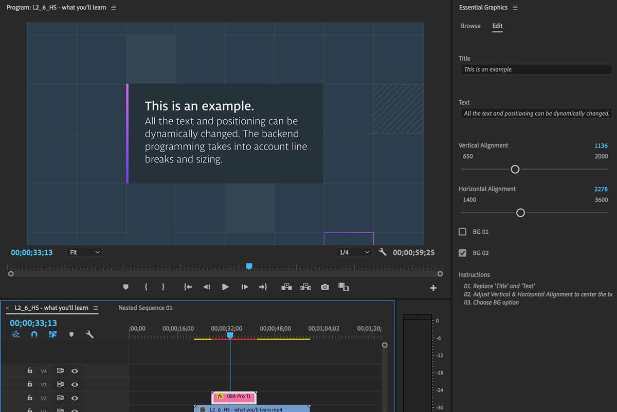
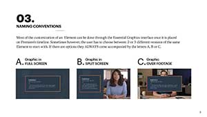
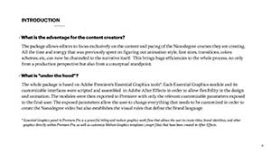
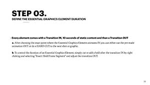
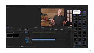
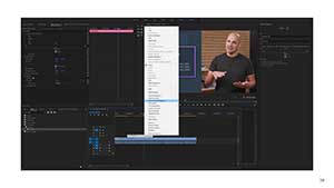
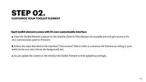
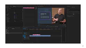
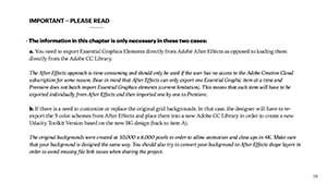
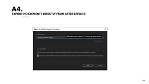
Using Adobe's Essential Graphics feature, complex animations could be changed dynamically right in video editing software using simple text boxes and sliders. Video producers could create their own animated elements on the fly without having to work with an external team of animators. No added turnaround. No more miscommunication or complexity.
The last step of the project was to create a guide that could be utilized by all the current video producers and be given to future employees so everyone was informed and confident in this new tool. A year later every curriculum at Udacity was using this new motion graphics system.






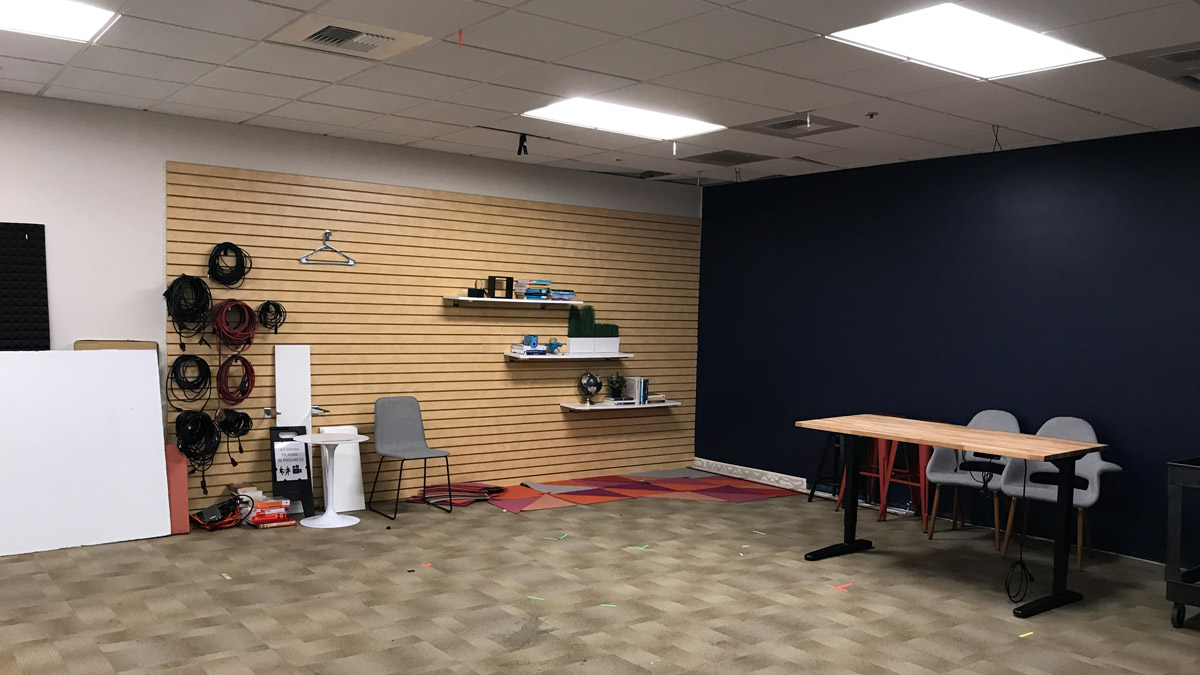
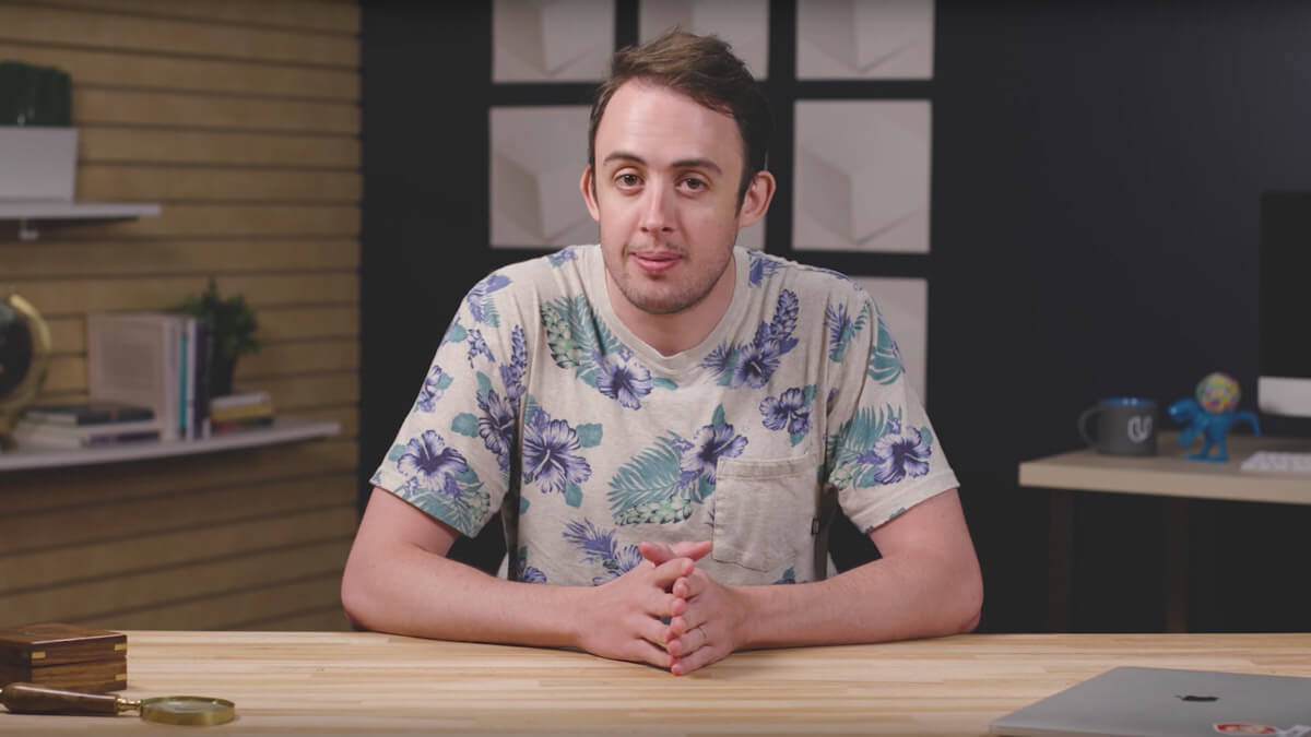
The old studio was slightly altered over the years by a dozen different producers leading to a chaotic, inconsistent set design.
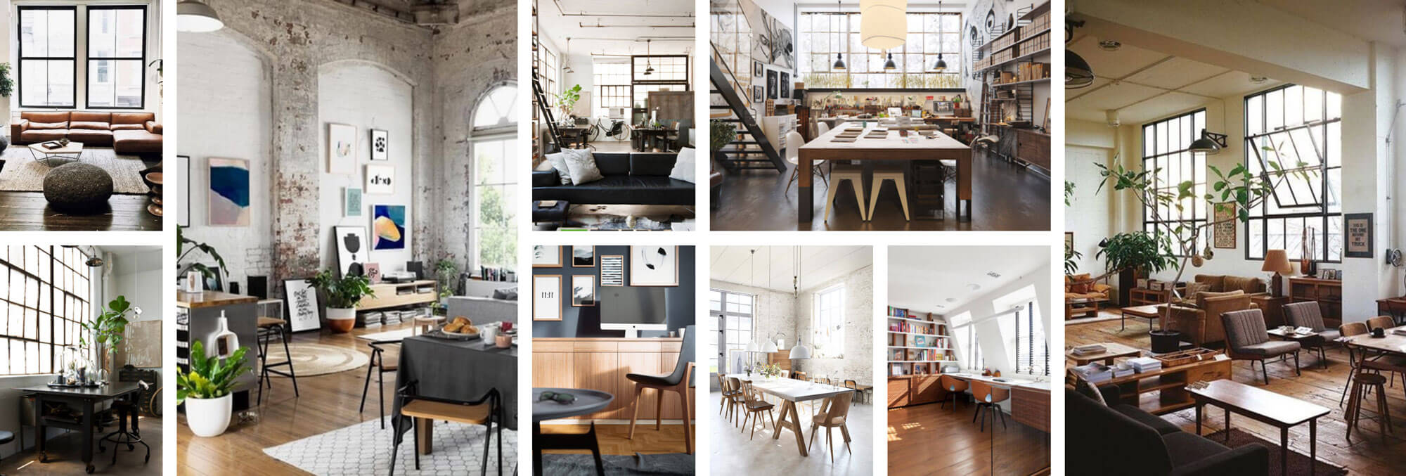
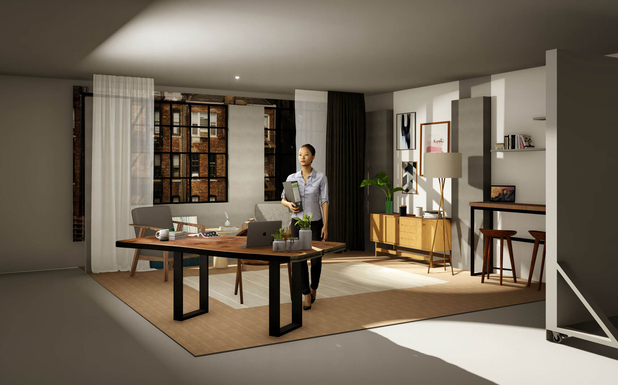
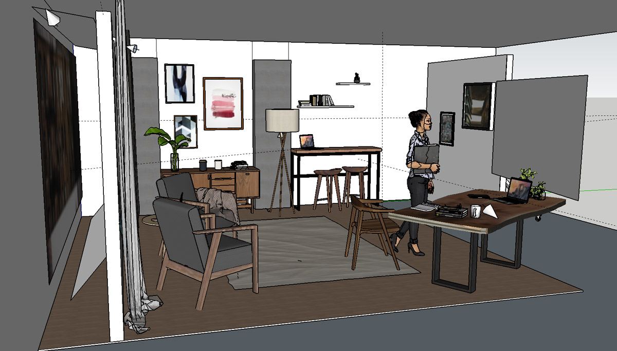
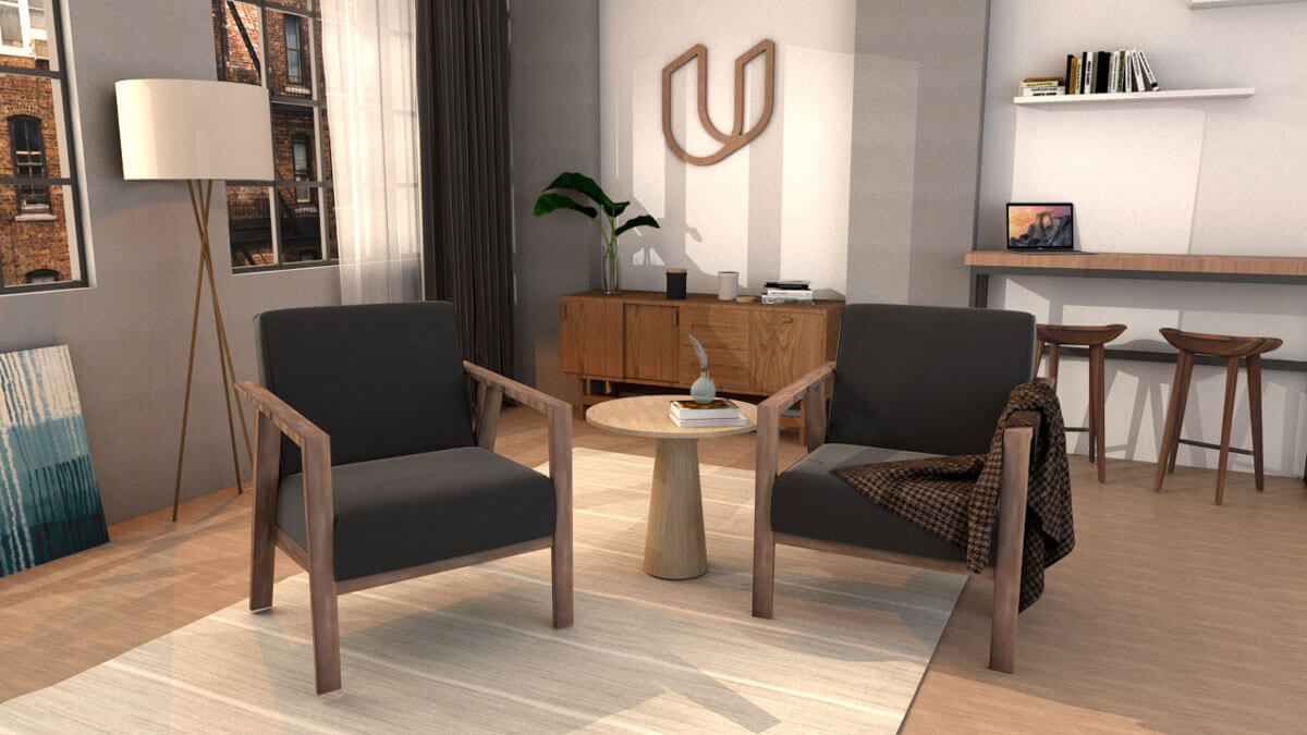
Inspired by industrial lofts and airy work spaces, the new set would allow a number of different layouts from table lecture to side by side interview. The construction of the new set was put on hold while Udacity relocated to a larger location. I was told the design was partially adopted after the move.
The produced videos are behind Udacity's paywall so unfortunately I can only give a small glimpse of the process here.
